
The color of us
I’ve been doing some new research on the “MOB Brown” or “Orange Shift” phenomenon I first blogged about back in 2006.
As part of that research, I’ve produced a number of intriguing composite images, which I thought I would share here. Before I proceed, I should acknowledge that some of this art resembles the work of Jason Salavon, who famously did a series of composite image of Playboy centerfolds. The resemblance is unintentional, it’s a side effect of using the same process, which I stumbled upon independently.
Like Jason, I’ve produced composite images by averaging the color values of the pixels of each source image, and then expanding their dynamic range, or “normalizing” them. My work is a little less pop-culture-focused than Jason’s, and I tend to use larger numbers of source images.
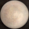
For example, I produced this average image of about 4,000 squared circle images from Flickr, back in 2006:
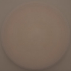
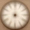
and then by normalizing the pixels, produced this “bronze shield”.
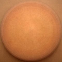
Here’s a more recent bronze shield using about 10,000 images:
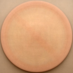
Here’s are some images of just coins (286 of them).
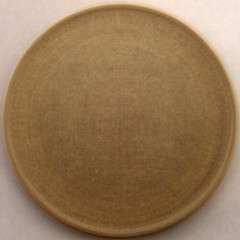
Here’s a few more images constructed from circles – see if you can figure out what they are:
Here’s a composite I made, reminscent of Jason Salavon’s work, of photographs of women from the “A Powerful Noise” project which I participated in recently.
Here’s one made from yearbook photos – all the members of a single graduating class:
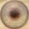
And here are 1,700 images of eyes.
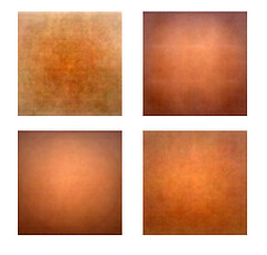
Like the bronze shield images, you’ll notice a pronounced brown/orange shift which is typical of these composite images.
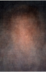
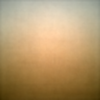
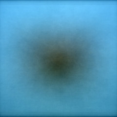
I named the color I typically see when I average together a bunch of images “MOB Brown”. It looks like this:
 .
.
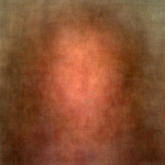
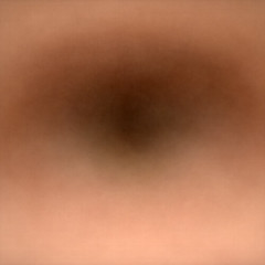
I named the orange color seen when these images are normalized “Brownian Orange’. It looks like this:
(Note: Both of these images are composites of 10,000 images from the Flickr Central pool).
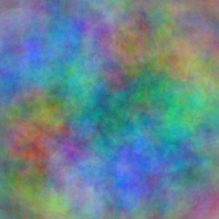
I had been assuming this orange shift was the result of natural sunlight, or camera flash, or camera image processing, so I was surprised to find that when I made composite images from purely synthetic imagery, such as computer art, there was also a pronounced orange shift:
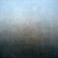
Just to make sure I wasn’t going crazy, I tried generating a composite synthetic image using a random number generator to construct the source images, and in this case, the result does not have an orange shift. The source images are simple images with random filled circles. The composite images came out like this:
Another way to make the orange shift go away is to use images which strongly color correlated, as in this image made from photographs tagged “antarctica”.
Here are some more like that:
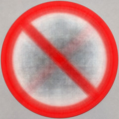
Here are a collection of signs that ban various activities:
I’ll leave you with one more correlated set of images: birds in flight.
Want to see more? I’ve posted more of these in my Flickr set of composite images.
UPDATE: While my own command-line scripts aren’t particularly user-friendly, Flickr hacker Dubster has made an online tool that you can use to average photos from Flickr together, creating images like these.

August 7th, 2009 at 9:06 am
Jim, after all this poking around, what do you attribute the orange shift to? Back in 2006, I tried to come up with some alternate theories to your sunlight/tungsten light theory. I figured it was an artifact of normalization due to the presence of so much sky in many pictures. I supposed the normalization would try to compensate for the propensity of blue by bumping up its complement. That theory is pretty well shot by your “birds in flight” set. My other theory is that orange is the average skin tone, but a little saturated. We humans just like to depict faces. What are you thinking now?
August 7th, 2009 at 9:25 am
I’m still not sure, but if I had to wager a guess, I would say it’s the chemical composition of the earth (e.g. “the color of dirt”) combined with the chemical composition of the sun. Our retinas appear to have evolved to be most sensitive to the more common colors around us (green and red), and I can see that much of the world around me has “earth tones”.
August 7th, 2009 at 1:12 pm
[…] « The color of us […]
August 7th, 2009 at 9:19 pm
[…] google shared The color of us […]